Don8
Removing Barriers From the Donation Process
Many people who donate to thrift stores are doing so as an act of sustainability, getting rid of things they no longer need while keeping them out of a landfill. But the challenges with donating often stop them before they ever get to the store. Outdated and inaccessible websites, unclear acceptance policies, and the frustration of arriving only to be turned away make the donation process more discouraging than it needs to be. Don8 was designed to fix that.
01: Project Overview
My Role
UX/UI Designer and Project Lead
Responsibilities
User research, personas, journey maps, wireframing, mockups, prototyping, project management
100%
Task completion, no prompting
Team
Collaborative project with 3 other students
James Madison University, Advanced Interactive Design (SMAD 317)
85
SUS
Score
Timeline
4 months, January – April 2024
Tools
Figma, Adobe XD, Miro
10–20s
Per task to complete key flows
02: Research
Competitive Analysis
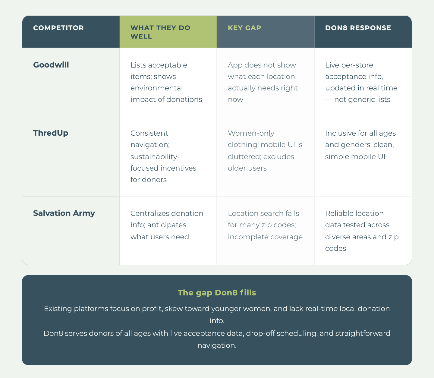
To understand the landscape before building anything, we reviewed existing platforms that touched on second-hand shopping, donation, or thrifting.
We looked at Goodwill, Facebook Marketplace, ThredUp, Depop, and Disabled American Veterans Thrift Stores, among others. What we found was consistent: most platforms are built for selling, not donating. These platforms are not built for people who just want to drop off a bag of clothes.
The gap we kept finding: no platform puts the donor first. None of them answer the question every donor actually has before they leave the house: "Will this store take my stuff today?"
User Research
Who We Talked To
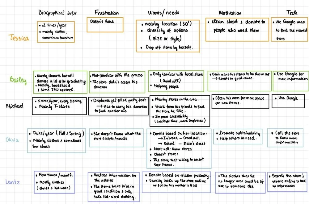
Our primary users were 9 individuals aged 18–45 who donate to secondhand thrift stores. We also interviewed 2 stakeholders (a thrift store general manager and a store owner) who represent the indirect user group that benefits when the donation process runs smoothly.
Participants were sourced both locally in Harrisonburg and from outside the area to capture broader viewpoints. Our sample skewed local and younger, which shaped our design priorities toward accessibility and transparency across age groups.
What We Heard
Most participants donate clothing 2–4 times a year, usually when the seasons change. Proximity is the number one factor in choosing a store, and people generally go to whatever is closest. Their motivations were consistent: decluttering, sustainability, and wanting their things to go to someone who can use them. Almost everyone described feeling good after donating: productive, lighter, like they had done something worthwhile.
But getting there was a different story.
03: Rationale
Data Synthesis
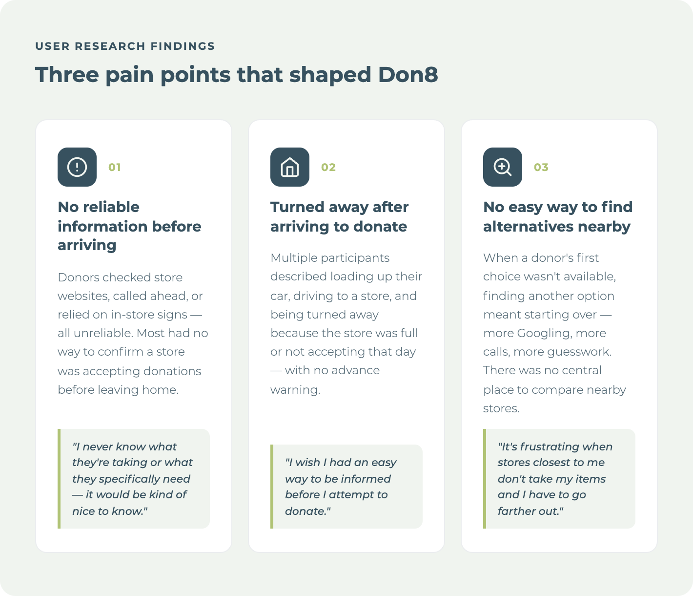
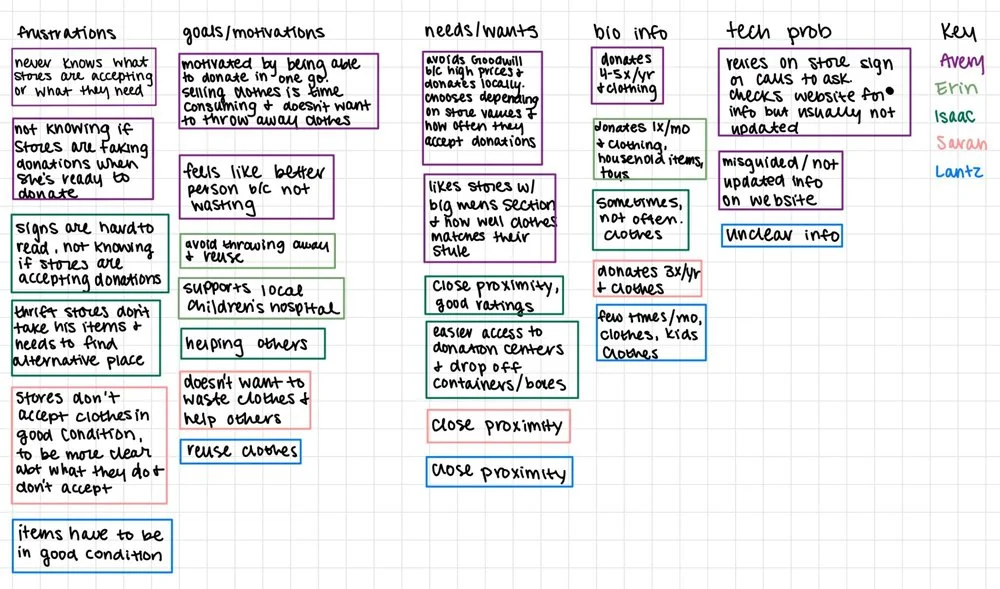
Each interview surfaced individual frustrations, but mapping across all 11 participants revealed something more fundamental.
Donors are not disengaged. They are motivated and emotionally invested in the act of donating. The friction lives entirely in the process, not the intention.
The affinity mapping also showed that stores and donors share the same core problem from opposite sides: both are operating without reliable, real-time information, and both pay a cost when a donation attempt fails. That dual-sided breakdown pointed directly at what we needed to build. Not an awareness campaign or an educational tool, but a live information layer that connects donors to stores before anyone gets in their car.
Design Problem Statement
People who want to donate to their local thrift stores have no reliable, centralized way to find out what stores near them are currently accepting, when they can drop off, or whether their items will even be welcomed. The result is wasted trips, turned-away donors, and a process that makes doing a genuinely good thing harder than it should be.
Understanding the User
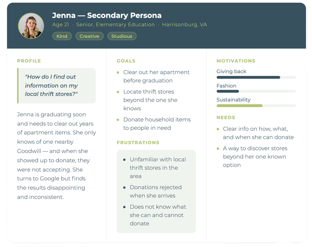
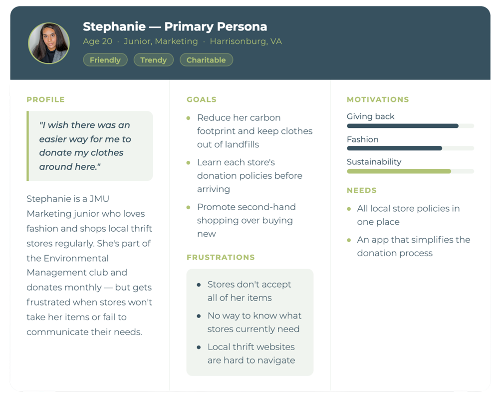
Personas
To make sense of the range of people we interviewed, we built two personas that represent the patterns we saw most clearly. Rather than describing any one interviewee, each persona captures a cluster of shared behaviors, motivations, and frustrations that emerged across multiple conversations.
04: From Research to Design
Three things kept showing up in our research regardless of who we talked to: donors didn't know what stores needed, they couldn't reliably plan a trip, and once they arrived, there was no guarantee their items would be accepted. Those three failure points mapped directly onto three design decisions. Every feature we built traces back to a specific moment of friction we documented in the research.
Features and Design Decisions
Low Fidelity Prototypes
Feature 01: Information Hub
Pain point: Users had no reliable way to know what a store was currently accepting before they left the house.


Feature 02: Schedule Drop-off and Pickup
Pain point: Users frequently arrived to donate only to be turned away. Convenient scheduling encourages follow-through.
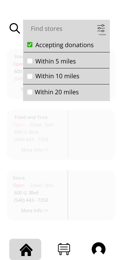
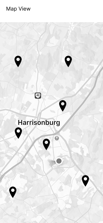
Feature 03: Search Filtering and Map View
Pain point: Scattered, inaccurate resources made it hard for donors to find stores and know what they were currently accepting.
05: Final Design
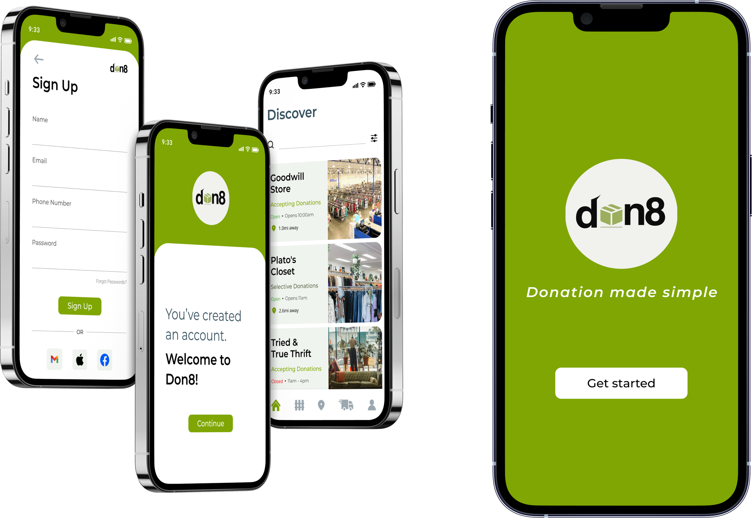
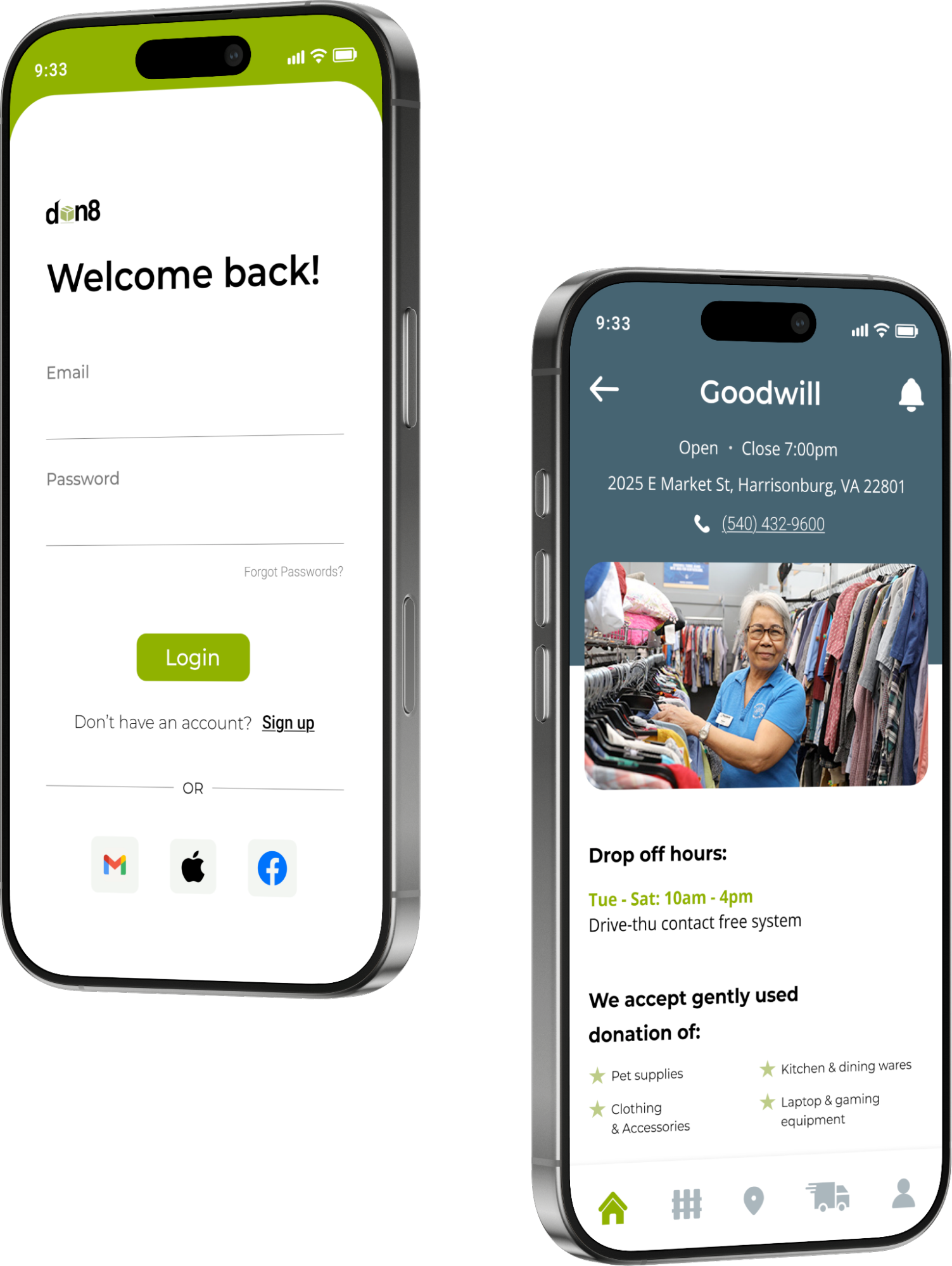
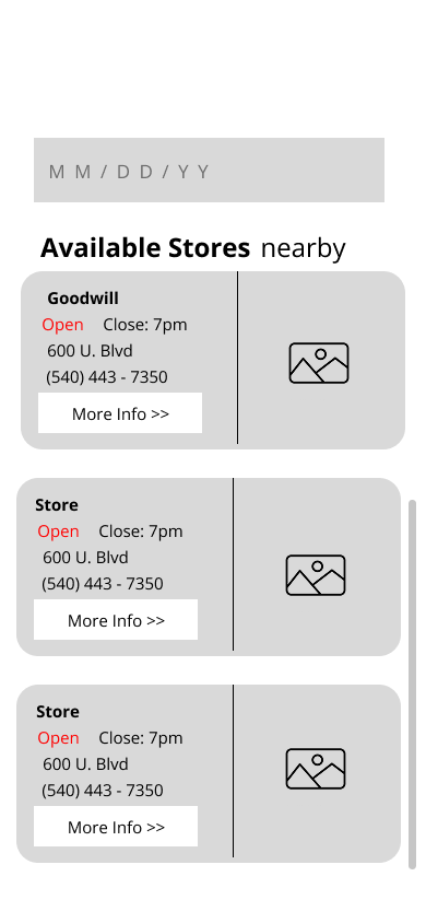
Feature 01: Information Hub
Pain point: Users had no reliable way to know what a store was currently accepting before they left the house.
The information hub gives each store its own page inside the app: current donation preferences, hours, address, and drop-off times. Once a user enables their location, the discover page shows nearby stores. One tap gets them to everything they need to know before they load up their car.
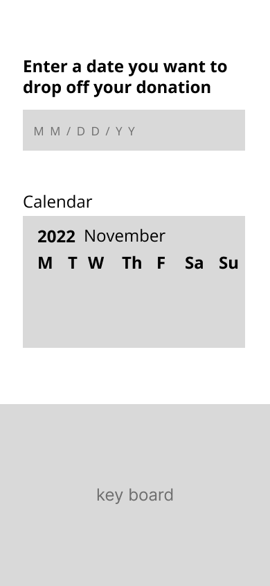
Feature 02: Schedule Drop-off and Pickup
Pain point: Users frequently arrived to donate only to be turned away. Convenient scheduling encourages follow-through.
The scheduling feature lets users select a date and see which nearby stores have drop-off or pickup availability. Instead of checking individual store websites, calling ahead, or just hoping for the best, donors can plan with confidence.
Feature 03: Search Filtering and Map View
Pain point: Scattered, inaccurate resources made it hard for donors to find stores and know what they were currently accepting.
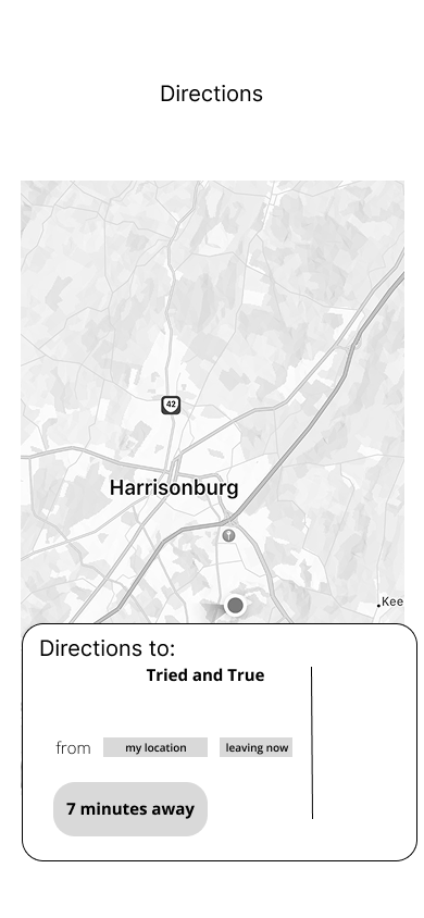
We knew a map view was needed, but a map alone just shows you where stores are. The more important piece was filtering. Donors shouldn't have to visit each store page individually to find out who's accepting what. The filtering feature lets users narrow results by acceptance status, proximity, and pickup availability, so they can find the right option for their specific situation without the guesswork.
The map view surfaces the closest accepting locations visually, which is useful when a donor's first choice is full and they need to find an alternative quickly.
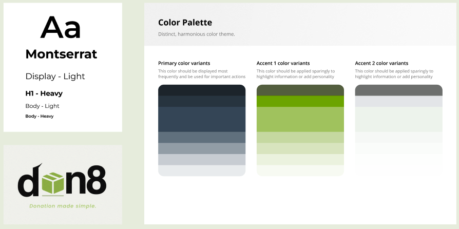
Visual Design
We landed on a minimalistic, clean design with earth tones to reflect the sustainability focus of the app without feeling heavy or preachy. We chose Montserrat for its clean readability, and used rounded corners and soft shapes throughout to give the interface an approachable, organic feel.
Key Flows
06: Testing & Results
Usability Testing Methodology
We tested the low-fidelity prototype first with 5 volunteers, then used the same 5 tasks for high-fidelity testing to get comparable results across both rounds. We wanted to see whether users could move through the core flows without guidance and where they got stuck.
What We Changed
Based on low-fidelity feedback specifically, we made several significant changes before building the high-fidelity prototype:
Added a back button and persistent main navigation to all pages.
Added more iconography and made input fields more obvious
Added confirmation screens so users knew when they had completed a task.
The improvement from low-fidelity to high-fidelity testing was measurable. Users still hesitated in some spots, but they recovered on their own, which is what we were aiming for.
High-Fidelity Testing
Users described the functionality as simple and easy to use
Participants said they would actually use Don8
Impact
An 85 SUS score and 100% task completion across core flows (without prompting) suggests Don8 meaningfully reduces the friction that currently stops motivated donors from following through.
For thrift stores, clearer donor communication means fewer low-quality donations and less operational waste.
For donors, it means showing up with confidence rather than hoping for the best. That's a small but real step toward making sustainable consumption easier for everyday people to actually practice.
100%
Task completion, no prompting
85
SUS
Score
10–20s
Per task to complete key flows
Reflection
What would I do differently?
Our sample skewed heavily toward JMU students in the Harrisonburg area. If I were starting over, I would push harder to include older participants, especially in the 45+ range, earlier in the research process rather than as an afterthought. One of our stated goals was building something inclusive across generations, and that's hard to do when most of your research data comes from 20-year-olds. The stakeholder interviews with Michael and Mary helped balance that, but I would have wanted more of it on the donor side too.
What did this project teach me about users that I didn't expect?
I expected to find that people weren't donating because they didn't care enough or didn't know how. What the research actually showed was the opposite. People feel genuinely good about donating. The emotional payoff is real and strong. The barrier is not motivation, it is confidence in the process. That realization changed how I thought about what we were designing. We weren't building a tool to convince people to donate. We were building something to make it safe to try and execute.